
Accessibility
Made to fit you.
Not the other way round.
People read, see, hear and move differently. Floe has one page of settings for that, and follows the ones your phone already has.
Yours to set, in Floe
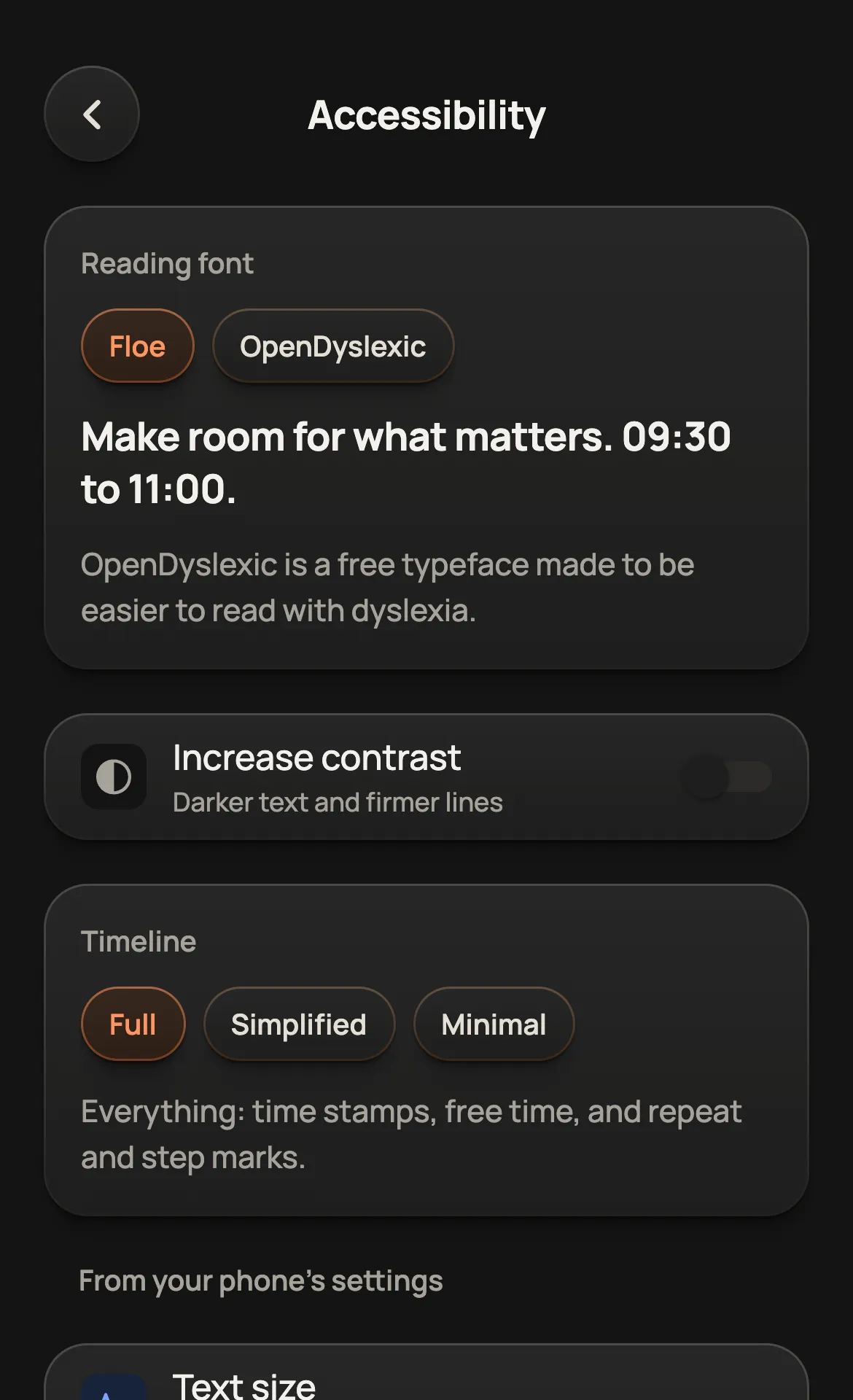
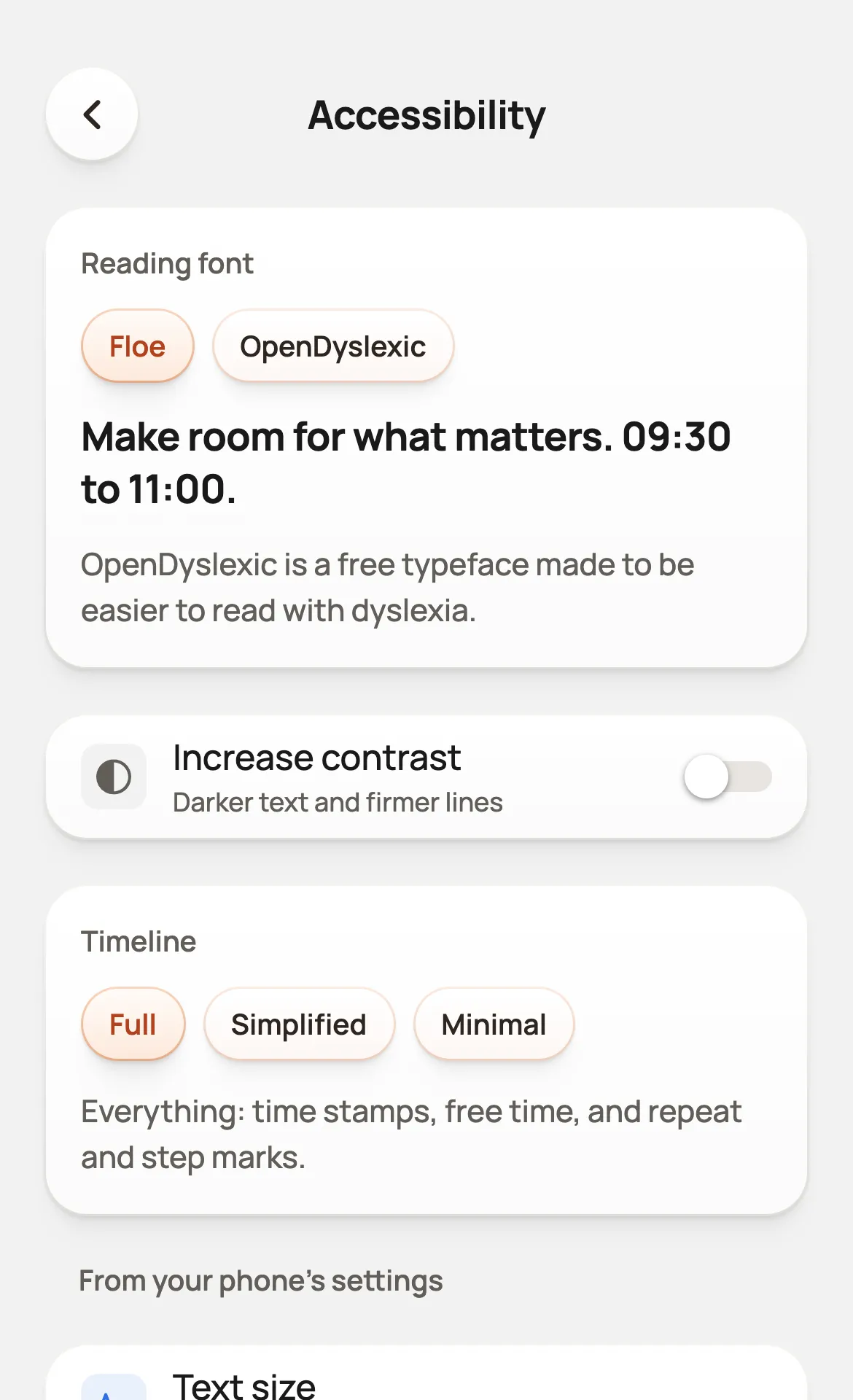
A dyslexia-friendly font
Switch the whole app to OpenDyslexic, a free typeface made for easier reading.
Accessibility → Reading font
More contrast
Darker text and firmer lines. Floe follows Increase Contrast on your phone, and has its own switch too.
Accessibility → Increase contrast
A quieter timeline
Simplified leaves out free-time notes and the small repeat and step marks. Minimal also leaves out the time stamps beside the timeline.
Accessibility → Timeline
Make room for what matters.
Make room for what matters.
Taken from your phone
Set these once in your phone’s settings and Floe follows along.
Screen readers
Buttons, tasks and timers have spoken names and say their state, for VoiceOver and TalkBack.
Voice control
Because every control is named, you can ask for it by voice.
Larger text
Floe follows the text size you set for your phone.
Less motion
With Reduce Motion on, slides, flips and drifting skies become short fades.
On this website too
Try them now. They are also behind the figure button in the bar, and this site follows your system’s contrast and motion settings.
Something not working for you?
Tell us what got in your way. We read every message.
Write to us